Oasys Okubo, University of Santa Cruz, CA
Oasys worked with the OpenTAP team as part of his Master’s project at the University of Santa Cruz. Below is a summary of his experience and achievements and how his work ultimately benefits the OpenTAP community.
Data Science is one of the most exciting fields of this century, uncovering mysteries and gaining knowledge from existing and emerging data. However, only until quite recently was data science able to demonstrate its full power. Recent increases in computational power enable more complex and faster calculations plus easy access to big data, providing more accurate calculations. Coupling these two trends permits a fuller understanding of underlying phenomena. This blog showcases a data science analytical project I have been working on in OpenTAP – Project Wonderwall.
Project Purpose and Goals
The purpose of Project Wonderwall is to show the health and vibrance of the OpenTAP project to the OpenTAP community through interactive visualization and machine learning analytics for the underlying data gathered throughout the OpenTAP lifecycle. The goal is to tell the story of this community and highlight the value of data science in it. Ultimately, the data means nothing if there is no narrative to help influence future decisions and to give OpenTAP a more thriving future.
This project consists of three phases of development
Phase 1 – Data Collection / Dashboard
Phase 1 of this project consists of data collection and dashboard development. The data collection involves collecting raw data sets from different sources, including Mailchimp, YouTube, Google Analytics, Discourse, GitLab, and the OpenTAP package repository, all key sources used by the OpenTAP community. These sources are ultimately collected and prepared for storage. Data scientists would say that the data collection and cleansing phase is the least enjoyable, however, I find it to be fun to ponder what kinds of visualizations and problems suggested the data. So I took time and thought to format the data to fit the criteria for ingestion by all dashboard components.
The data collection and dashboard development phase has proven the reality of all data science implementations; the data collection and cleansing phase is the most time-consuming of any other component of this phase, with data being the most important component of the project. There are several components of data preparation that are crucial steps. The goal of this phase is to make the data pipeline and visualization as easy as possible. Furthermore, for dashboard development, it was not only important to arrive at useful visualizations but to work with the team to figure out which visualizations would best describe the progress of the OpenTAP project and community.
Phase 2 – The Narrative
Phase 2 of this project is the narrative. This portion of the project emphasizes the importance of explaining the data to allow anyone to understand what is truly going on. Data is very messy and confusing to look at and truthfully, the majority of the work performed in data science is mainly comprised of cleaning the data to make it easier to handle. Up to 70% of data science is cleansing the data, with the rest spent on making it presentable, mostly with visualizations.
With that said, this portion is important because explaining each visualization offers the OpenTAP community a narrative, and telling a story creates a bond between the data and the community members. The narrative helps community members understand the implications of participation and emphasize the significance of why and how OpenTAP is a great and thriving community.
Phase 3 – Analytics / ML
Businesses are awash with data. So much data that much goes unused, even if that data offers great power to a business when leveraged to its full potential. This potential is best harnessed through machine learning (ML), applying data analysis to automate model building. ML is a branch of artificial intelligence (AI) based on the idea that systems can learn from data, identify patterns and make decisions with minimal human intervention. ML coupled with big data is truly a powerful tool in environments like the OpenTAP project, aiding in decision-making to benefit this community for the long term.
There are multiple reasons why Analytics/ML is an important part of this project. It supports making better decisions faster and more efficiently, helps identify opportunities, and allows project staff to adopt best practices and focus on issues that matter, to expand the benefits of OpenTAP and benefit the software industry as a whole. Data science empowers these goals with quantitative, data-driven evidence allowing for more efficient scaling and expansion.
The Dashboard
In this project, four areas within OpenTAP proved crucial to the narrative. These quadrants tell a story that matters to the OpenTAP community, speaking eloquently of growth since its inception.
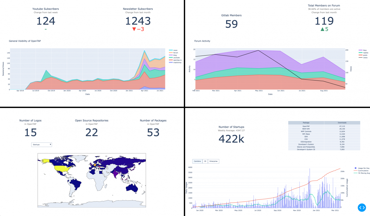
Visibility
The first quadrant describes Visibility, emphasizing how OpenTAP is viewed by the public. This section not only illustrates the growth of OpenTAP over time but also stimulates discussion of key trends. One of the components in this quadrant is the general visibility graph of OpenTAP, tallying views across all media. There is a noticeable correlation across the majority of media, which signifies the close relationship the community has with each medium. This correlation shows how the OpenTAP community is engaged across media simultaneously and that most community members (users, devs et al.) are at least browsing those.
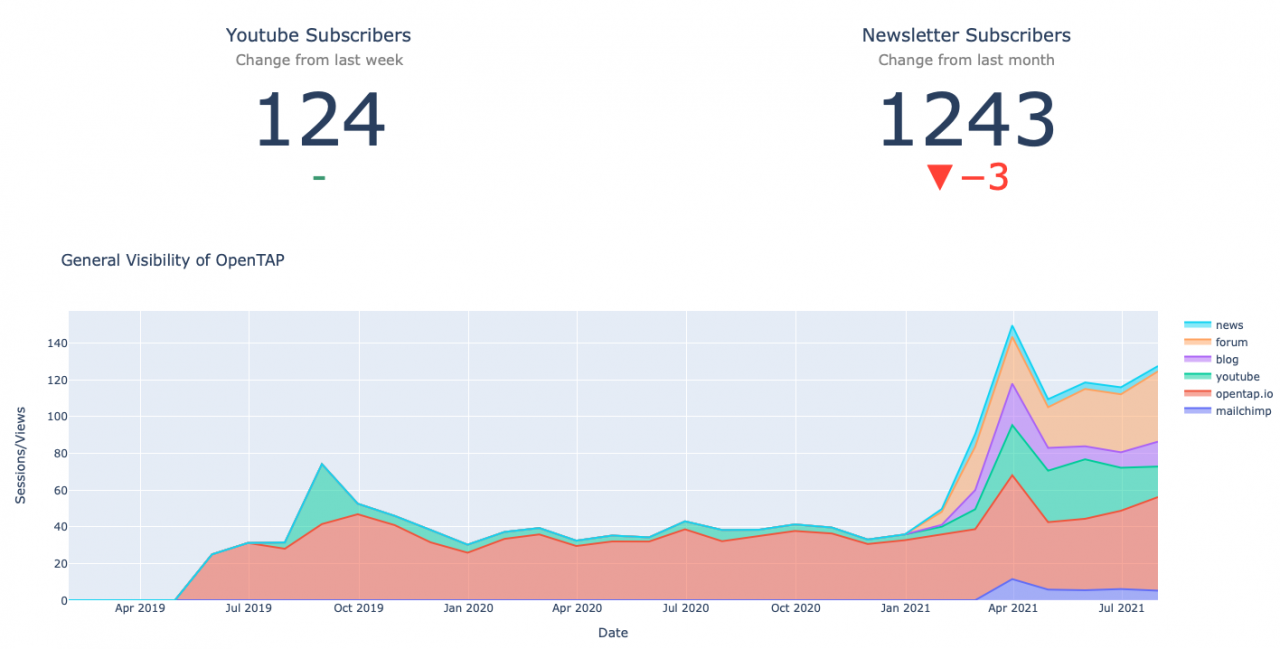
Community
The second quadrant represents Community Engagement, analyzing the health of the OpenTAP community and also showing how many users are engaging with OpenTAP (viewing assets, downloading, installing, running, etc). We wanted to emphasize the importance of how users engage with OpenTAP with data sources from the forum and GitLab to monitor the community activity. This quadrant also illustrates community sentiment and can be correlated with postings for other media. For example, does a spike in Forum activity correlate with a spike(s) in activities in other media, but perhaps with a complex causation, by including likes, replies, posts, etc.
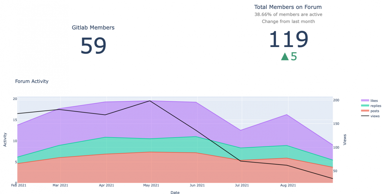
Ecosystem
The third is Ecosystem, a quadrant to display the quantity of OpenTAP software and packages, as well as to show the number of companies using OpenTAP in their pipeline. Moreover, the OpenTAP team wanted to show off the utilization and exposure of the platform and of products based upon it. This display offers an interactive world map to show which countries have been exposed to OpenTAP via which media and how much activity there is in each. It is a “heat map” where the darker colors represent the lowest levels and the brighter colors the highest degree of activity. It is important to see how users from around the world are utilizing OpenTAP. This visualization helps pinpoint the locale of activities and can target regions of interest for further OpenTAP exposure.
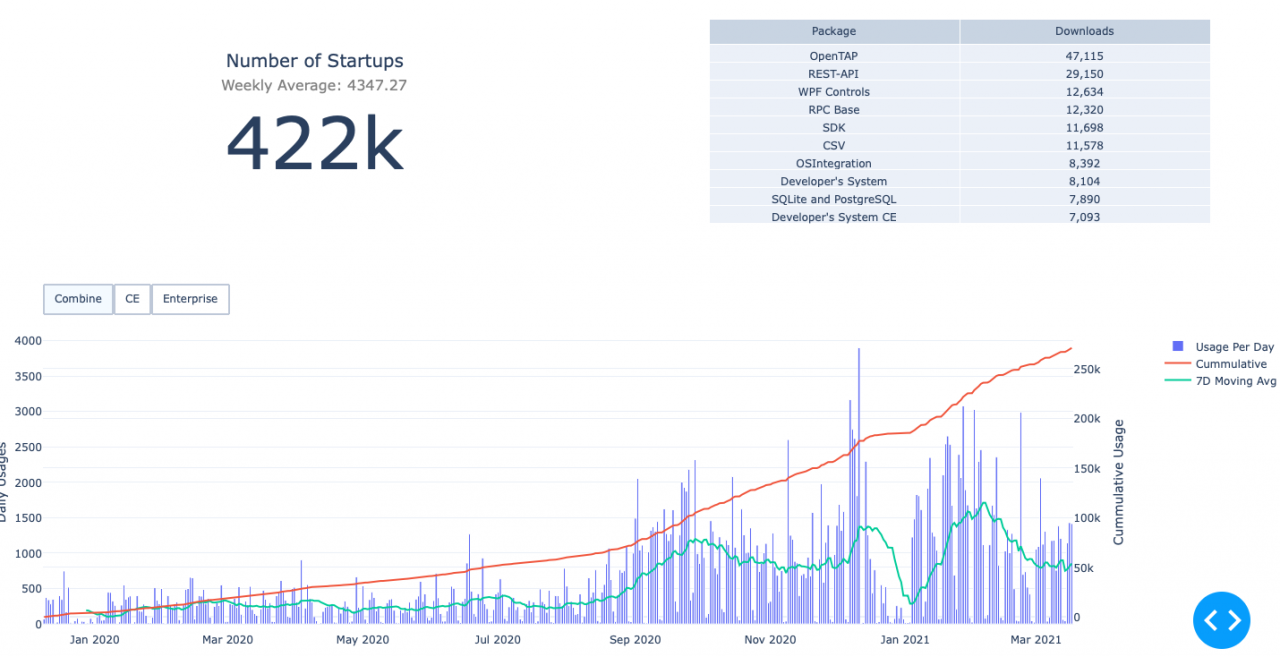
Usage
The fourth quadrant represents Usage, showing how OpenTAP usage over time as well as indicators that aggregate other statistics. We can see here on the bottom graph that we can switch among editions – Community Edition (CE), Enterprise, and combined, to show both separated and aggregated download activities of OpenTAP packages. The different lines help view the growth of OpenTAP in many aspects. Firstly, the more general view captures the daily downloads of packages, signified by the blue bars. Next, seeing growth over time pinpoints the progress of package downloads (red line). Last is the 7-day moving average. We can see a general trend with the blue bar with most of the activities being on the weekdays. We can also see by the cumulative line that the overall growth and usage are increasing at a greater rate than previously, highlighting the growth of OpenTAP utilization. Overall, this section can help identify and stimulate questions as to why certain days are spiked with activity and why the moving average is trending. This visualization aids in decisions on which media focus engages more users.
The analytical questions that arise as a result of these visualizations provide a powerful tool for business strategy and gauging overall sentiment. Not only does it make it easier for business decision-makers to consider the best option for long-term growth, but it also shows ecosystem participants how much the community is growing as a result of technical development in OpenTAP.
Conclusion
Overall, this project has been a learning adventure in data science and absolutely the most valuable experience for me. I am grateful for the people involved and those who mentored me. I would like especially to thank Brennen DiRenzo and Jeff Dralla for their commitment to this project and for their invaluable help. I can’t trade this experience with anything else and I look forward to seeing OpenTAP evolve in the future.
Future
I’m excited to share some of my next steps in this project and for the future of OpenTAP.
Going Live Online
My first and most important step is to take this project live on the OpenTAP website. In embracing the OpenTAP open-source culture, it is very important to take Wonderwall live and allow users to interact with the visualizations.
Machine Learning
ML and AI will let us analyze the data even more deeply. The mission of my Data Science project is to treat the WonderWall dashboard as a preliminary step towards developing new ML algorithms.
Since finishing the dashboard, I have embarked upon a few new projects: The first is to search across OpenTAP media to see if there are correlations among variables, making it easier to create predictive algorithms. My next challenge is to determine the best time of the week to post a newsletter. For this task, I plan to use a time series forecasting algorithm called SARIMA, which is a seasonal autoregressive integrated moving average. On top of that, we can also add data that affects OpenTAP community activity, such as newsletter post dates as input. With this data, we can predict potential future views of a medium.
Throughout this project, there has been much collaboration with the team with the development of the visualization dashboard, however, we have come to a point where we have developed a minimum viable product which can of course be further developed into something very sophisticated. Although I would have loved to work on this even further, there is a time limit on the amount of time I can even work on this project, and I am very satisfied with what I was able to develop during this phase. I should go onto the next phase of the Wonderwall project and that is to write a narrative on the dashboard I have created and to paint a story to tell a deeper meaning of the underlying data and what connections each OpenTAP medium have with each other for the visualizations to appear that way. This is very important because although the data is much easier to interpret visually, it may still be confusing what the meaning of all these graphs can send to viewers, so the goal of this is to ease this issue and allow a connection between viewers and the dashboard for full understanding.
About the Author

Oasys Okubo is a Master’s student in computer science at the University of California, Santa Cruz. His encounter with Jeff Dralla of Keysight kickstarted the Wonderwall project in February. Joining Jeff was Brennen Direnzo, who mentored Oasys throughout the project.